Wednesday, January 30, 2013

Made in the USA - Studio Roeper


I view furniture makers as artists and I like it when they treat their craft that way. My father was one - as a hobby - and what he made was always amazing and beautiful. So I like featuring furniture makers that view it as the artful craft that it is.

Studio Roeper is a California-based design firm with a wood-shop located 
in the former Alameda Naval Station - so right away you know that whatever is made there is going to be special, cool, and interesting (in a good way).

Furniture maker and founder of the company, Florian Roeper, studied sculpture, furniture design, and graphic design before deciding to focus on furniture-making. Roeper handcrafts small production lines of high-end furniture, interior doors, and works of art. 

"The pairing of raw, earthy tones with clean contemporary lines, aims to engage the discerning individual who seeks warmth amongst the modern, and subtlety among the exclusive," is how Roeper describes his products.
Studio Roeper Door


Studio Roeper Dining Table


Studio Roeper Accent/Coffee Table


Studio Roeper Artwork

Roeper believes that design "begins with extensive research of materials and technique. Simple yet sophisticated, elegant yet dynamic." 

Apart from his signature etchings onto metal, Roeper specializes in the sourcing and milling of unusual, native California hardwoods. He uses salvaged trees such as Black Acacia, California Walnut, American Red Elm, and Redwood.

Studio Roeper furnishings have been featured in California Home+Design, Woodwork, Interior Design, The Robb Report, DFL-Design for Living, Angeleno, Architectural Digest and Craft.


Even if his style is not yours, you have to appreciate someone that can take rough, raw materials and make them beautiful and functional. What do you think?

If you would like to see more of my design stuff, you can follow me on FacebookPinterest or Twitter.

Thank you for visiting My Head Space!

Tuesday, January 29, 2013

Romantic and Sexy Bedrooms

Perhaps because Valentines Day is just around the corner, or maybe it's because I still haven't been getting enough sleep, but I just have bedrooms on my mind.

I compiled some bedrooms that I consider romantic and some that are just down right sexy. They are not your lacy, flowery rooms so if that's what you like you may not like my inspirations. I just prefer them to be masculine with a hint of the feminine. I'm just not a flowery girl - what can I say. Always been more of a tomboy I guess.

One thing a lot of them have in common - they have four-poster beds or some sort of take on a four-poster. Love that look and have done since I was a little girl. I'm not sure why. Maybe it's the princess in me. Regardless, there's a lot of that. Also, lighting is key. Most of the rooms have some great lighting which is key to setting the mood. Some have great view whether it be mountains or sea. Mostly, though, they just look cozy, warm, and oh so comfy. The type of room you would want to stay in for hours.


Contemporary Bedroom design by New York General Contractor IPD Partners, Inc.


What do you think of these rooms? Do they put you in the mood or just put you off? What do you think makes a bedroom romantic and sexy?

If you would like to see more of my design stuff, you can follow me on FacebookPinterest or Twitter.

Thank you for visiting My Head Space!

Copyright 2013, Cristina Mullins Interiors. 

Monday, January 21, 2013

Affordable Kitchen Update – Cabinets


Having family and friends for the holidays and not too happy with the state of your kitchen? Here are some quick, easy and relatively inexpensive updates you can make to your cabinets to give it a fresh, new look.


1. The easiest change you can make by far is updating your cabinet hardware. Go drastic. Are your current knobs old fashioned and country? Try modern and funky. Don't have hardware? Just drill holes into your cabinet and add them. You'll be surprised what a difference this will instantly make.


Antiqued painting technique with stencil on doors contrasts with dark wood cabinets
2. Paint your cabinet doors – yes just the doors. It requires a little bit more time and effort (sanding and priming are essential steps), but the results can be dramatic. If your cabinets are in the otherwise good shape, painting them can boost their appeal instantly. The contrast with the rest of the cabinets can be striking. The opposite is also true – if you paint only the cabinets you can achieve a similar look. 


Mirrored upper cabinets add sparkle - House Beautiful
3. A few other tricks to try with your doors – If they are paneled you can paint just the inside or outside of the panel - you can do this on all or just upper or lower cabinets. For limited upper cabinets only - you can also remove the panel and add glass, mirrors or chicken wire. If they are flat doors you can easily add a simple molding to give it a more finished look. You can even paint the inside panel with chalkboard paint! 


Tutorial on how to paint your cabinets
4. If you have the time and inclination, paint the entire cabinet. Pick a color that compliments the style and look of your home. Right now, anything goes. But light, creamy ivories are a good bet. They will instantly brighten your kitchen and will go in just about any style home. And feel free to use two colors – one on the upper cabinets and something complimentary with maybe more color or a deeper color on the bottom.


No upper cabinets - just a few shelves
5. Remove upper cabinets altogether. Clear out all of you unnecessary kitchen items. You may find you don't need all of that storage. Removing upper cabinets can dramatically open up a kitchen. In some cases, you may be able to replace some of the cabinets with open shelving. You can display your dishes and glassware there – or even neatly stacked dry items. You can also hang pots and utensils on the wall – which makes it visually interesting and functional.

Some tips for painting:
Make sure you remove the doors before painting. Wipe down, sand, clean and then prime cabinets and doors before painting. Make sure you use at least an eggshell or semi-gloss paint. Please arm yourself with good tools and do some research. Talk to experts – Lowes and Home Depot are great resources.
Good luck and enjoy the process! And post your comments and pictures too.


If you would like to see more of my design stuff, you can follow me on FacebookPinterest or Twitter.

Thank you for visiting My Head Space!

Copyright 2013, Cristina Mullins Interiors. 


Saturday, January 19, 2013

Stylish Rooms on a Budget? Yes!


I'm not feeling well - I have one of those lovely winter colds. So I'm entertaining myself online - there's only so much TV a girl can watch (and I've watched my entire DVR list). One item I've been determinedly searching for for quite a while is a coffee table for our living room. I very much dislike the one we have - it's at least 10 years old and not my style. I would classify that as needing a new living room coffee table. My dear, fiscally-minded husband, who purchased it, would classify that as "wanting" a new coffee table and not actually "needing" it since we already have one and we barely use it. In other words, I have no real budget. It's an issue, but that's a whole different type of blog. 

Anyhow, I wanted to see if I could find something close to my budget of $0. (The glass and brass coffee table featured below currently has a $130 bid - please don't bid against me! Sorry Steve.) Which got me thinking about how so many budgets are tight these days. 

Affordable AND beautiful home furnishings are out there. You don't even have to leave your house to find them because there are so many discounted shopping options online. Flea markets and thrift stores are very fun to attend, however, and great places to find unique items. I don't like garage sales because it's too much driving around (and to get the good stuff would require me to wake up way too early on a Saturday morning), but if you're lucky you might find a treasure that way also. 


So I created this room. I think it's elegant and modern with a touch of whimsey. Best part - it's on a relatively tight budget. This entire set of items cost under $3000! 

How did I do it? First, I found the coffee table. Then I started thinking about what I would put with it if I had to start from scratch. I started with the sofa and loved the classic twist of the grey tufted back. I'm really loving teal right now so I searched teal rugs and found this one which added the tan to the palette. The rest grew from there. Whether you can afford a new room right now or just a few items, I wanted to show you that you can make your home beautiful without spending a ton.

1. Curtains  (here)
2. Sofa (here - 10% off sale this weekend!)
3. Throw (here)
4. Tray (here)
5. Lamp Shade (here)
6. Lamp Base (here)
7. Prints (here)(here)
8. Chair (here)
9. Votive Holders (here)
10. Worm Table Decor (here)
11. Book Stack (here)
12. Bird Table Decor (here)
13. Coffee Table (here)
14. Vases (here)
15. Artwork (here)
16. Rug (here)
17. Paint (here)


Can't afford $3k? Hmmm. Sounds like a fun challenge to me. Craigslist and Free Trade are great places to look for very affordable stuff for your home. 

Do you like it? Not so much? Would love to hear from you.

If you would like to see more of my design stuff, you can follow me on FacebookPinterest or Twitter.

Thank you for visiting My Head Space!

Copyright 2013, Cristina Mullins Interiors. 

Wednesday, January 16, 2013

Gilded Living - Black & Gold Living Room


If you enjoyed my previous post on the Gilded Dining Room, I hope you will take a look at elements that you can use to implement a bit of that same glamour and opulence of that gilded time into your own living room this time!

Here are elements of a living room. I made the background white or soft grey again (here) so you can see how it would work with both. The white is more crisp and contrasting. The grey reduces the impact of the contrast of black and white so it softens the room a bit.

If you were to actually put most of these elements into a room, I would add a bit more glass  (as in a coffee table) or crystal (sconces, chandelier) to the mix. I just wanted to show you the options that are out there, but mixing with crystal and glass adds another glamorous layer to the mix.


1. Bar Cabinet  (here)
2. Sofa Table  (here)
3. Curtains - Grey velvet (here)
4. Sofa (here)
5. Pillow (here)
6. Floor Lamp (here)
7. Eucalyptus Sculpture (here)
8. Pillow (here)
9. Lounge Chair (here)
10. Vases (here)
11. Side Tables (here)
12. Flokati Rug (here)
13. Coffee Table (here)


Stay tuned for upcoming blogs on more hotel inspiration and Made In the USA furniture companies. What are your thoughts? Would love to hear from you.

If you would like to see more of my design stuff, you can follow me on FacebookPinterest or Twitter.

Thank you for visiting My Head Space!

Copyright 2013, Cristina Mullins Interiors. 

Monday, January 14, 2013

Gilded Dining - Black, Gold & White

The Gilded Age of the late 19th and early 20th century was a time of industry and growth in the United States. During this time, exquisite homes were built using opulent materials that denoted the wealth and prosperity of the time. 

Perhaps because of the upcoming release of the Great Gatsby movie, or because we are all so wishful of the return of our country to those more prosperous days, the resurgence of that style of decorating is making a comeback. However, it should be reflective of our more modern and frugal times. 

If you enjoyed my previous post on black and gold decor, I hope you will take a look at elements that you can use to implement a bit of that glamour and opulence of that gilded time into your own home.

Here are elements of a dining room. I made the background white or soft grey (here) so you can see how it would play. The white is more crisp and contrasting. The grey softens it and creates a bit more warmth.


1. Dining Chair - Gold-embossed velvet and black gloss wood chairs (here)
2. Chandelier - Silver/gold leaf finish hanging light (here)
3. Artwork - 'The Fact' (here)
4. Dinnerware - Gold place setting (here)
5. Chair - Leather and brass (here)
6. Bowl - Large Bird (here)
7. Vitrine - Brass cabinet (here)
8. Dining Table - white (here)
9. Flatware - Brass (here)
10. Tray - Gold leaf (here)
11. Table lamp - Crystal base (here)
12. Horse - Pottery figure (here)


Stay tuned for my next blog on how to put a gilded living room together. What are your thoughts? Would love to hear from you.

If you would like to see more of my design stuff, you can follow me on FacebookPinterest or Twitter.

Thank you for visiting My Head Space!

Copyright 2013, Cristina Mullins Interiors. 


Wednesday, January 9, 2013

Obsessed w/ Black Gold and White


OK - so I've been working with a beautiful client and lately we've gotten into some bright brass, gold-leaf and black. The room until recently was largely white, but the addition of the brass/gold and black has taken it from Miami Modern to West Coast Glam and it is G-O-R-G-E-O-U-S!

I'm not at a point in the project yet (i.e. - not everything has arrived) where I can show you the space, but I would like to share with you some additional rooms that I have found that helped to inspire me. 


Many of you have already seen and commented on this room that I posted on FB. Now take a look at the rest. You will understand why I'm obsessed!

Unfussy black steps, white moldings, and brass railings. So pretty and clean.


Kitchen w/ white counters, black and white cabinets, and touches of black and brass/gold.

Desk area - black, white, and gold are well balanced in this vignette.

Traditional minimalism - base of white, black furniture, and gold accessories.


French Embassy for Cultural Services - Payne Whitney Mansion, built in 1902. Gorgeous doors. Green ivy is stunning.

This house takes the scheme to the outside. How beautiful is the golden light through the windows?

Stay tuned for my next blog on how to put a black, gold and white room together. What are your thoughts? Would love to hear from you.

If you would like to see more of my design stuff, you can follow me on FacebookPinterest or Twitter.

Thank you for visiting My Head Space!

Copyright 2013, Cristina Mullins Interiors. 

Sunday, January 6, 2013

Why White Rooms Work - Or Not


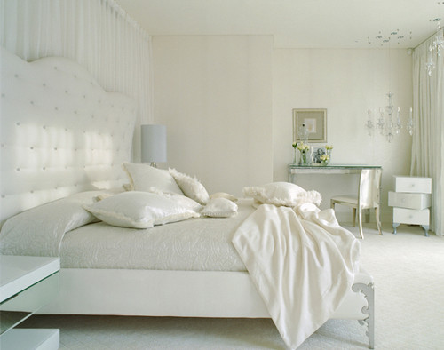
My example white room. Does it work - or not?
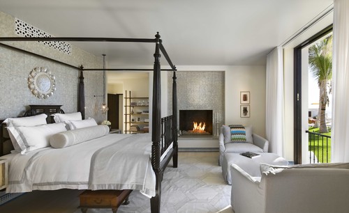
A few weeks ago, I posted a picture of a white room on my Facebook page. I wanted to get your opinion of the space. I was curious how many of you would like it and how many would not. I also told you that I would let you know my opinion of the room.

First, let me say that decorating with white brightens a room and creates the illusion of a larger space. Best of all, white is suitable for any taste or style - traditional, transitional, contemporary, etc. If you ever rented, you were probably forced to live with white walls and might have grown to dislike them. However, keep in mind the variations of white are numerous. Sherwin-Williams offers 184 different variations of white in their color palette so there is no shortage of colors to choose from.

Sherwin-Williams family of whites

So what is my opinion of this particular room. Here goes...

First the disclaimer - decorating is extremely subjective. I know that because I work with many clients who have completely different tastes. It is all about your own personal taste and style. So if you like the room as is, that's fine. However, I can tell you that to my eye it is missing some things that are needed to finish it so that it becomes the stunning room it's trying to be. So I guess I just gave it away. Yep. I don't like it. 

It's not because it's horrible or anything like that. I feel it's not finished. It's missing some critical elements that would make it warmer and more complete. That's why I chose to show it to you. I felt this room was the perfect jumping off point to discuss what makes white rooms work - or not.

Let me take you through it and see if you agree:

Large white pot and container in fireplace.
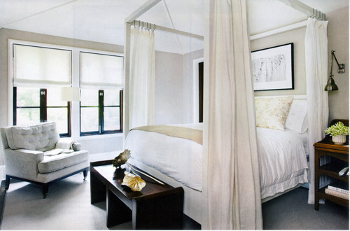
1. Eliminate too much contrast. The point of an all white room is that your eye can sort of float from one thing to another without any one item demanding too much attention. The fireplace, in this case, is a big black hole - as someone pointed out. You are looking for tranquility in this room and instead your eye is forced to go to the fireplace. This focal point needs less focus. The issue is, your eye is going to go to the one thing that looks the most different or out of place. In an all white room, it's going to be any color, or in this case the void of color. So what can you do short of painting the inside of the fireplace white (which I do not recommend, btw)? 

Try to reduce the amount of black that's showing. There's a few ways to do that, you can put a stool or a bench in front of the fireplace, you could also put white candles in silver or crystal or white holders, you could put varying sizes of vases, or even white logs. You could also get a nice metal fireplace screen in front. The point is to try to counteract all that black with some white to soften the appearance of it. 

A little color and a lot of white.
2. Keep artwork soft and neutral. If you have made the decision to do an all white room then stay true to your vision. The artwork above the fireplace bothers me - in my opinion it does not belong in this room. It's too strong and dark for this light, airy room - like the fireplace itself. Wall art should be minimal in color - like the piece that is hanging above the chair by the windows. Look for pieces that primarily read as white and soft in hue. Or you consider framing smaller pieces in white or metallic frames with borders in white. 

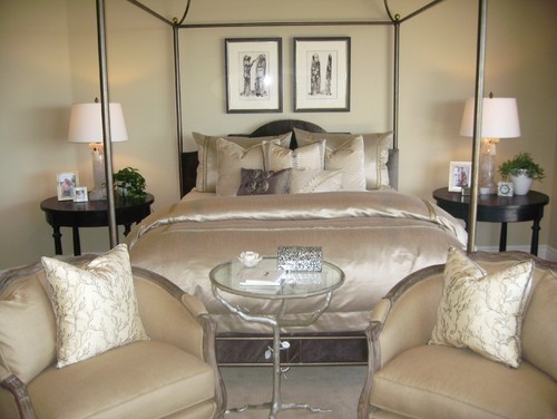
3. Add texture and pattern. A monochromatic palette works best when there are lots of textures to catch the eye. Different surfaces absorb the light differently, creating multiple tones. That is why layering textures is so important. Think about satins with wovens or metal and glass with wood. They all play different with the light and that is why creates interest. In the case of this room, while there are some varying textures, there is not enough. All the fabrics, with the exception of two throws and the sheepskin rug, are cotton. In this room,  an opportunity to use different fabrics and surfaces was missed. 


The texture of the wallpaper, the bedding, headboard, mirror - all gorgeous textures
that play with the light, but maintain the rooms quiet elegance and interest.
4. Play with tone. White is far from boring. As you saw above, Sherwin-Williams alone has 184 colors of white so there are literally hundreds of varying shades and tones of white, ranging from bright hues with a cool milky feel to warmer historic shades that create depth. In our room, warm whites would help to soften the room and given a sense of comfort which would pair perfectly with the existing bright whites which give it its modern, minimalist vibe. The lack of varying textures could have been fixed by layering more tones of white. The lilac footboard and two blankets are the only variation. They missed an opportunity to warm up the space by adding warmer tones in the chair by the window, the floor by the bed and pillows on the sofas.


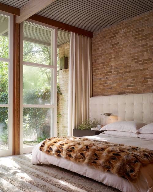
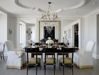
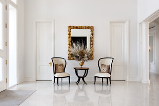
Beautiful tones of white on white on white.


Tone-on-tone white space - lovely.

5. Play up architectural elements. Beams, interesting ceiling lines, arches, or moldings are beautiful in white. One way to play them up is to paint them in a semi-gloss instead of just a flat white paint. It has the same affect as textures do on fabrics and add a certain element of elegance to the room.


Nieborów Palace - The White Room - just look at the molding and trim!

If you would like to see more of my design stuff, you can follow me on FacebookPinterest or Twitter.

Thank you for visiting My Head Space!

Copyright 2013, Cristina Mullins Interiors.