


Back in 2011, I wrote about the Pantone Color of the Year which was Honeysuckle - a sort of darker, not so bright pink. I loved the beautiful soft touches of pinks in the room designs that I featured in that story. They were soft and sophisticated - as were most color trends.
As we approach 2013, bold color is definitely back in a big way. All over the fashion magazines you see bold color combinations, jewel tones and even slightly more "sophisticated" neons. Can neon be sophisticated? I mean totally. Gag me! (Sorry. Small 80s flashback.) But it's not just fashion that is going brighter.
Last night I was looking through some of my favorite blogs and magazines. And I was noticing lots of hot pink/magenta tones. One particular blogger, http://atlantic-pacific.blogspot.com, posted pictures of her latest outfit creation. She wore bright red heels, with her bright red skirt, and a bright, hot pink sweater topped off with a leopard print coat. It was a fabulous combination and she looked fierce.
The red and the leopard print I get. Actually, I have gotten - I literally wore red pants and leopard print shoes over the weekend. And as far as decorating is concerned, that combination first made it's appearance - well forever ago. But what about the hot pink?! I must admit, it's not typically one of my go-to colors, but it's definitely growing on me. Plus, we're always talking about bringing the outside in. Guess what, there are hundreds of hot pink blooms!
I found room examples for most areas of your home, including the kitchen! Some I love, I can appreciate because it was done well even though I might not opt for hot pink cabinets. Regardless, I wanted to showcase this very pretty color!
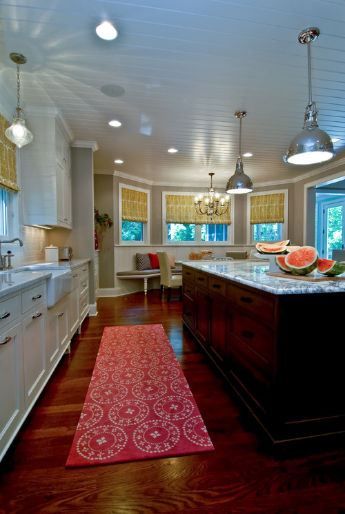
This kitchen uses hot pink only as a bright accent color to offset the neutrals.
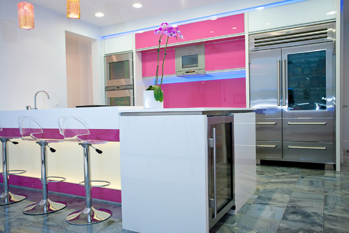
Hot pink cabinets? No punches were pulled when creating this kitchen.
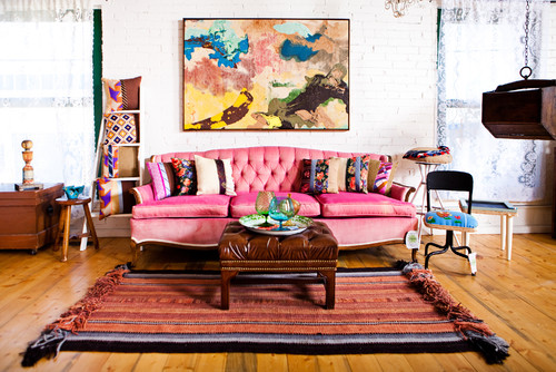
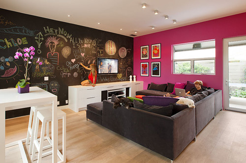
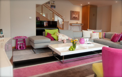
The sofa is hot pink AND velvet and it looks fantastic and completely non-girlie (though some men might disagree) in this fun, boho-chic living room.
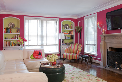
In this space they also used the hot pink sofa, but with all of the other brights it doesn't really have the impact and presence it should. I will, however, point out the black trim work because it is really beautiful.
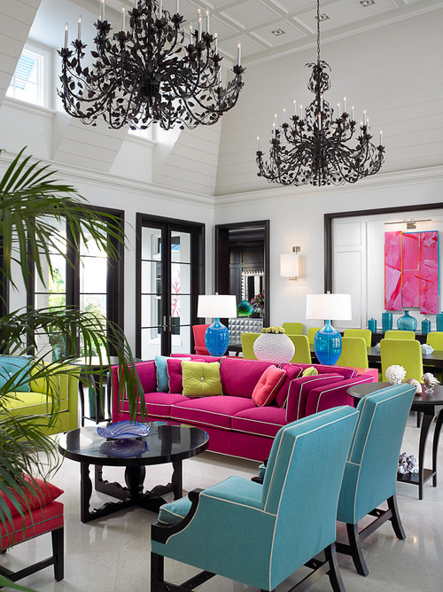
Contemporary Living Room design by Other Metro Interior Designer John David Edison Interior Design Inc.
As an accent wall in an otherwise neutral playroom, the magenta is fun and unexpected.
There are two styles going on in this room and I'm having a hard time reconciling them both in this particular space, but kudos to the homeowner/designer for being so courageous in their wall color choice.
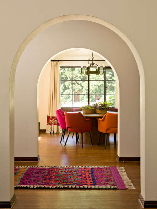
Hot pink and dark brown. Are you noticing the trend? Love it here, but I'm not sure why they chose to put the pink fabric over only one window. I feel like this room could use just a bit more of the accent color. I would still be happy to work in this space.
Traditional Home Office design by Minneapolis Interior Designer Martha O'Hara Interiors
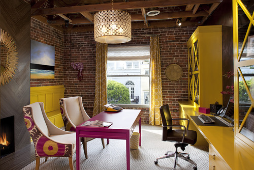
This office is using two very bold colors. The pink and yellow work well, especially because of the wood and brick elements that keep it from being too much. It is not for the faint of heart.
This combination dining/living room is made all the more lovely with the use of the bright pink - lots of it in the dining room and a little less in the living room. Very pretty.
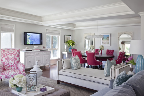
Working off the entry rug, this dining room combines multiple chair colors to bring fun and whimsy to the formal dining space.
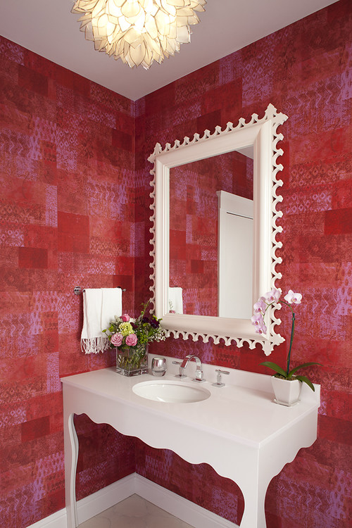
This powder room is so pretty - and you would look so "pretty in pink" in it. The light reflecting off the walls will create a lovely light in the room giving everyone a beautiful pink glow. The walls are so bold that the all white mirror and vanity are perfect partners.
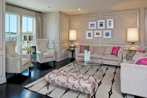
Like the office above, I wish they had used a bit more of the bold pink. I feel like something is missing. It would really offset the neutrals so well to add a bold runner or some more accent in fabric shades or art? It needs just a bit more to liven up the otherwise very pretty room.
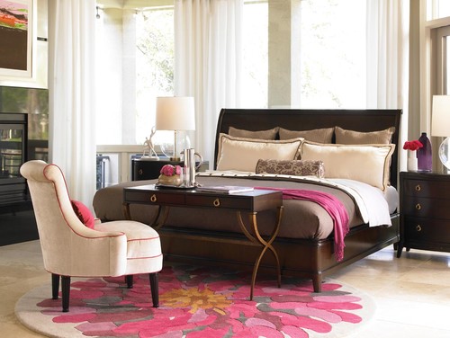
Too much hot pink in the bedroom and it starts to look like a little girls Barbie dream room. This one has the perfect touch of strongly, masculine furnishings with pretty pink touches. Very nice balance.
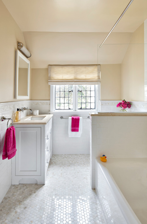
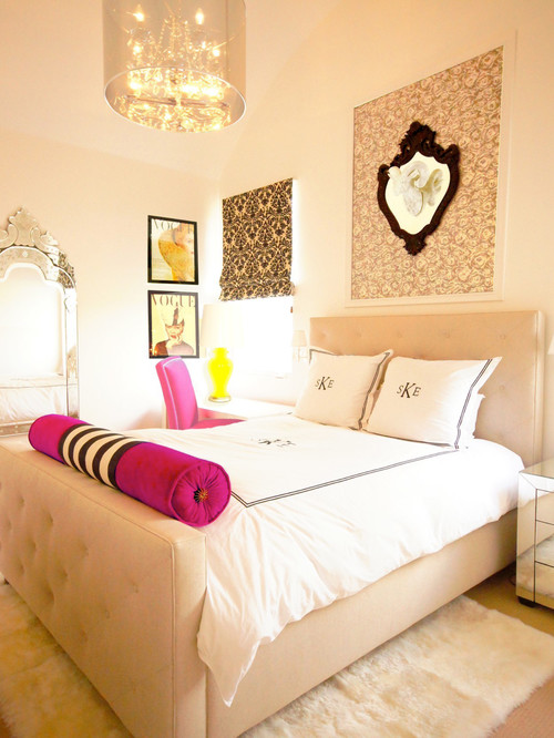
This bedroom also uses just a touch of the pink. Very pretty and tranquil space.
When I was 15, my parents built their dream house. A gorgeous tudor-style home in a bucolic area of Maryland. It was their dream home and my dream bedroom as I got the bedroom suite any girl would love - huge bedroom, walk-in closet and my very own bathroom en suite. Loved it! The colors in my bathroom? Pink and gray. Granted the pinks and grays were more in tune with the palette of the day - pastels. But still - pretty. I have always loved that color combination though it's been out of style for some time. As an homage to my parents dream house, here are some gorgeous updated examples of that color combo.

This office is using two very bold colors. The pink and yellow work well, especially because of the wood and brick elements that keep it from being too much. It is not for the faint of heart.
Contemporary Home Office design by San Francisco Interior Designer Artistic Designs for Living, Tineke Triggs
This combination dining/living room is made all the more lovely with the use of the bright pink - lots of it in the dining room and a little less in the living room. Very pretty.
Working off the entry rug, this dining room combines multiple chair colors to bring fun and whimsy to the formal dining space.
This powder room is so pretty - and you would look so "pretty in pink" in it. The light reflecting off the walls will create a lovely light in the room giving everyone a beautiful pink glow. The walls are so bold that the all white mirror and vanity are perfect partners.
Eclectic Bathroom design by San Francisco Interior Designer Artistic Designs for Living, Tineke Triggs
Like the office above, I wish they had used a bit more of the bold pink. I feel like something is missing. It would really offset the neutrals so well to add a bold runner or some more accent in fabric shades or art? It needs just a bit more to liven up the otherwise very pretty room.
Too much hot pink in the bedroom and it starts to look like a little girls Barbie dream room. This one has the perfect touch of strongly, masculine furnishings with pretty pink touches. Very nice balance.
This bedroom also uses just a touch of the pink. Very pretty and tranquil space.
When I was 15, my parents built their dream house. A gorgeous tudor-style home in a bucolic area of Maryland. It was their dream home and my dream bedroom as I got the bedroom suite any girl would love - huge bedroom, walk-in closet and my very own bathroom en suite. Loved it! The colors in my bathroom? Pink and gray. Granted the pinks and grays were more in tune with the palette of the day - pastels. But still - pretty. I have always loved that color combination though it's been out of style for some time. As an homage to my parents dream house, here are some gorgeous updated examples of that color combo.
What do you think of the pink? If you have any pink in your home, please share.
If you would like to see more of my design stuff, you can follow me on Facebook or Pinterest.
Thank you for visiting My Head Space!
Copyright 2012, Cristina Mullins Interiors.
No comments:
Post a Comment