Wednesday, October 31, 2012

Orange

Happy Halloween!

I have orange leather chairs in my living room. They are the first pieces that I purchased after I moved into what is now my home, but was at the time still "the house my husband built." His style was modern and colorful and I felt like that was a good place to start. That was almost 10 years ago and those orange chairs are still in the living room holding court.

I'm amazed that everyone talks about orange making a comeback. It never actually left, but like any other color it becomes more or less popular with time. Nevertheless, the past couple of years has seen a resurgence in orange.

In honor of the orange holiday, Halloween, I wanted to share with you some of my favorite orange items:


Artwork from Etsy seller BrandMojoImages
Console Table from IKEA
Birdcage Pendant Light from Sky Iris

Whitaker Chair in Stockholm Saffron from Jonathan Adler

Lacquer Block Cocktail Table from Jonathan Adler
Thoughts on orange? Do you like it or not? 
Copyright - Cristina Mullins Interiors, 2012 or visit me on Facebook

Tuesday, October 30, 2012

Can You Mix Metals?


The short answer is - yes. You can read on if you want my explanation or if you need convincing... :)

I work with a lot of clients that are left with the choices that were made by the previous owners of the home. Replacing the metal items in your home can be very costly - have you ever counted how many door knobs you have in your home? Or what if you love a particular lighting fixture, but it only comes in one metal color and the rest of your house is all in another tone? What do you do?

My favorite saying when decorating is - embrace that which you cannot change. So if you have brass doorknobs all over your house, but you are into brushed nickel or have shiny chrome faucets but like the look of black oil-rubbed bronze what can you do? Embrace the metals and mix it up.

For the past several years, layering colors has been all the rage in fashion. Have you noticed the layers upon layers of bracelets and necklaces in different styles and colors? I love that look and have tried my hand at it lately. It's so fun and immediately adds interest to an outfit.

All that is beautiful in fashion eventually makes it to the home - and layering metals is no exception. So take a look. Let me know what you think - do you like it? Would you be brave enough to do it?

Pretty mix of jewelry metals and styles.

A neutral backdrop makes the mixed elements standout.

Again neutral backdrop and nice mix of metals.

Mix of styles woods and metals. So pretty.

Simple modern pieces highlight mixture of materials.

Take a look at my Ideabook on Houzz.com - below. I've mixed some products together to create a Master Bedroom. I kinda love it. What do you think? Would love to hear your thoughts. 


Copyright - Cristina Mullins Interiors, 2012 / Visit me on Facebook.

Monday, October 29, 2012

My 10 Favorite Glamorous Bathrooms


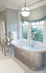
Love this tub. It's traditional with a glamorous twist.
And the mixture of large and small tiles adds an extra
touch of luxury.
http://reasonstobreathe.tumblr.com/page/4

Besides my Master Bedroom, my Master Bath is another area of the house that I would love to renovate. The materials that you use in a bathroom are part of the allure for me. All of those glorious, shiny surfaces. It would be so difficult, even for me to choose. 

Here are some of my favorite, glamorous bathrooms. They inspire me to design a new space for us. I hope they inspire you too!


I'm assuming the rest of the bathroom is just as amazing,
but who cares with a commode areas like this?
http://www.houzz.com/photos/luxury-master-bath/p/882

This is truly elegant. The archways and galley aspect of this Master Bath.
You can see all the way from the Master Bedroom. Just a beautiful sight-line.
http://www.houzz.com/photos/luxury-master-bath/p/84

The unexpected punches of red (see previous Blog - Red Obsessed) and
the sculptural chandelier. Both unexpected and fabulous.
http://www.houzz.com/photos/luxury-master-bath/p/273

So light and bright.
Clean, pretty, elegant. Not much more needs to be said.
http://www.houzz.com/photos/luxury-master-bath/p/735

The archway and wood-veneered built-in shelves make this tub feel
more like a piece of furniture than just a jacuzzi-style tube.
http://www.houzz.com/photos/luxury-master-bath/p/735

So much storage and so elegantly done. And the use of lights to
add that bit of glamour in what could otherwise be boring.
http://www.houzz.com/photos/luxury-master-bath/p/651

I love the tile behind highlighting the sinks and mirrors framed with the
chocolate paint. Clever way to highlight that area.
http://www.houzz.com/photos/luxury-master-bath/p/861

Looks like this bathroom took full advantage of every inch by placing
the tube right next to the shower, though it looks a bit tight. What I love about
the design, aside from the clean modern features, is the feature wall.
http://www.houzz.com/photos/luxury-master-bath/p/903

The problem with bathroom above is solved in this bathroom. The entire tub and
shower area is enclosed in the glass. Very smart - and still a beautiful design.
http://www.houzz.com/photos/luxury-master-bath/p/105


What do you think of these gorgeous bathrooms? Do you have any you would like to share? Comments, questions? I would love to hear from you. 

Visit me at http://www.facebook.com/pages/Cristina-Mullins-Interiors/172070179510468 or email me directly or www.cmullinsinteriors.com


Copyright - Cristina Mullins Interiors, 2012

Sunday, October 28, 2012

10 Ways to Cozy Your Home aka How to Survive Sandy

I live on the East Coast - just a bit outside Washington, DC. So we get all of the seasons. My favorite is always fall. I love the slight chill in the air and taking out my boots and sweaters. I love the leaves changing color and falling. And I love snuggling up in my Snuggie (yes I have one!) and reading, watching TV, or working on the sofa. 

Unfortunately, this fall we are in the path of Hurricane Sandy aka Frankenstorm. Which got me thinking about what we could do to buckle down for this nasty storm and get cozy.

So here are my top 10 ways to cozy your home:

Furry Comforter - Wildcat Territory
Cozy throws like this one is cashmere -
etsy.com (ibbiknits shop)

Throw pillows in cozy knits too - countryliving.com

Don't have a fireplace to warm up to? Here's a movable one -
peepculture.com

Cozy up with books and magazines and put them in a
pretty rack - eurway.com

Warm candle light - I don't recommend this if you have
little ones in the house, but maybe some scented ones.


Bake a pie or something yummy with pumpkin and
then eat it. Yum! It's cozy for your tummy.

Hot cocoa with marshmallows, tea or coffee. Something warm
to make your insides cozy too.

Love cozy cotton jammies. This one is so pretty and
romantic. - peruvian connection

Snuggles
and Cuddles.

Any other suggestions for getting cozy this fall and/or surviving Hurricane Sandy? I would love to hear them.


Friday, October 26, 2012

Holly Hunt Does Not Pay Me...

This table inspired this blog. Art & Furniture.
SELENITE SIDE TABLE
Design Brenda Houston
It's true. Holly Hunt does not pay me. I do not work for them. BTW, if you're not familiar, in the interiors world Holly Hunt is a star, but not the same adorable star that you see in the movies.

So let me just say - Holly Hunt has some of the most beautiful furniture available today!

Pieces from this company include some of the most classically modern, traditionally contemporary, beautifully, functionally designed furniture. I'm consistently amazed at how gorgeous their pieces are. They work with some exquisite designers. 

Unfortunately, this beauty also comes with a price tag, but if anyone is truly interested and has a few extra Gs, let me know cause I can at least offer my Trade pricing. But even if you're not in the market - at least take a look. You'd be hard pressed not to find something that you love.

From HOLLY HUNT Showroom
Holly Hunt Studios

From HOLLY HUNT Showroom
Holly Hunt Studios

From HOLLY HUNT Showroom
Holly Hunt Studios

DRAGONFLY BENCH
Holly Hunt Studios

HADRIEN BED
Design Jean-Michel Wilmotte
HEMP SAIL CLUB CHAIR
Design John Hutton
AILERON OCCASIONAL CHAIR
Design Christophe Pillet
From HOLLY HUNT Showroom
Holly Hunt Studios

From HOLLY HUNT Showroom
Holly Hunt Studios

PIRI BENCH
Design Christian Astuguevielle

From HOLLY HUNT Showroom
Holly Hunt Studios

DARDER WINGBACK CHAIR
Holly Hunt Studios
 Did you see anything you liked, loved, or hated? Let me know. I would love to hear from you.

Thursday, October 25, 2012

My Top 10 Bedrooms From House Beautiful

I am speechless about this room. Love the palette, the styling.
Love it all. I having bedroom envy. 
One of the areas of my home that causes me the most irritation is our Master Bedroom. There is lots that is wrong with it - but that's for another day - so I love looking at Master Bedrooms for my "some day"  Dream Master.

One place I tend to find lots of inspiration is House Beautiful. I love the magazine and the online newsletter both! My husband can attest to the fact that I keep back issues for far too long! 

Recently, House Beautiful featured 80+ "Beautiful Designer Bedrooms" to inspire.

I looked through all of them - there were actually 95. And I didn't like some of them, and some I found very pretty.  Out of those, however, only 9 did I truly love. Here are my picks (and pics):


This is more traditional and formal than what I would choose,
but again the colors, symmetry. I looks like a lovely B&B. 

Something so French about this room. The lovely 4-poster
is the queen of the room. And all of the touches of gold.
It's like spending the night in Versailles.

This room captured my attention because of
the wallpaper. It almost looks like a cozy
coverlet all over the wall.  And still completely
sophisticated.

This looks like a Parisienne bachelor pad. It's masculine,
and a bit cave-like. And the red throw - so sexy.
Monochromatic - at it's best, though I do wish
the wall was a warmer white.

Talk about masculine. And again, not my typical style,
but it's so rich and masculine. And the light elements balance
out an almost too-dark room.


I like the simplicity of this room, and love the built-ins
with mirrored panels. That and the chandelier take it from
too plain, too simply elegant.

I have lots of colors like this in my closet for fall
and winter. Looks like a rich, cozy cashmere sweater.
And the wood on the ceilings. Just gorgeous.
OK - I said 9 and this is #10. I would have passed
right by it if not for the striking magenta chair.
Way to add punch.

I these rooms bring you inspiration too. And if one of these happens to be your Master Bedroom - aren't you lucky!?! 

Questions, comments - it's all good. Send me something. Would love to hear from you.